Thursday, 24 December 2015

Tour Dates Poster

This is the poster we put together detailing the dates and locations of our band's tour. The list is all made up of real venues that we researched to make sure a band similar to ours would be performing in.

Sunday, 20 December 2015

Student Reflection

Filming - Our filming for our video started out really well. Filming our flashback footage, first at south end on sea and later on in London went very well and we were able to get all the shots that we had listed in our storyboard. The shots all came out well, were varied and all interesting and usable. Our performance shoot in primmer hall was less successful, could be considered a failure to some shoot as all the footage shot on that day didn't survive any further than the first draft and ended up being scrapped, not being used for anything besides the initial trailer. After putting together this draft however, we went back with a much better plan for filming, better lighting equipment and more hands to help out getting more shots that were more varied. Everyone did really well in filming, as for the performance we all had to be on camera.

Editing - Editing started out well, having the flashback footage to put together in a montage was actually quite easy to edit together. I managed to sort out the chronology of the clips that seemed to make sense and didn't clump to many of the same type of shot together so they looked more varied and spaced out as the video cut together. I did all the effects and filters on these clips as well as the flash transitions and I think they turned out well, being the only part of the first draft received well. Editing the footage from the first performance however was much less successful. Because the footage was so static, and badly light, the colours of the shots fluctuated all over the place, making the video look very inconsistent tonally, unless a lot of colour correction was added and by that point it was obvious to the viewer that there were colour correction filters over the clips. The lack of movement and variation in shots here also may the video incredibly monotonous and dull to watch, people after seeing just the first draft saying it was boring.
This was all changed however after we got our second bout of perfomance footage. Editing sped up very quickly after this shot and Marcus started helping out with putting the cuts in place and even did an animation for the opening of the shot.

Digipak - The digipack overall was very successful. It was put together mainly by Marcus however I did give him a lot of input as to how to do a lot of the techniques in Photoshop that he wanted to do to make the pack. I also did a lot of the editing of the base images and he then put them together in the main digipack. We were able to get a very cohesive digipack with a good colour scheme that matched across all the segments of it.

Website - Katie did most of the work on the website, putting it together on Wix. The website came out really well in the end, after we had the colour scheme established by our Digipack we were able to alter the website to match that and look like a product that related to the band along side the digipack. We were able to make a good amount of pages on our site like merchandise, tour dates and galleries of pictures from our photoshoots.

Thursday, 17 December 2015

Our Digipack, in comparison to other band's


After completing our digipak we've decided to compare our digipak to others from similar bands, this way we can see how potentially successful it would be in the real world. As you can see the similarities between the digipaks are they all have a consistent colour scheme throughout, they have albums lines, bar codes, album names, band names, artistic pictures that represent the name of the band and the album such as the mountain used in our digipak. There is one main difference which is our digipak uses much more colour, but we don't think this is a bad thing as it still looks very much like a indie band digipak, but it also adds an element of originality to our band because our colours stand out compared to many others.

Magazine Article


Wednesday, 16 December 2015

Feedback on final draft

After finishing the edit of our final draft, we showed it to others to get their feedback on what they liked so that we could see what the most successful elements of the video were. While the video is finished and wont be changed as a result of this feedback, it is good to know where we were successful to know what our strengths were in putting together a music video and perhaps where to improve when doing similar work in the future.
- Really liked the flashback edit

- Liked the concept of music video

- Thought the editing was good

- Didn't like the performance shots

- Some of the shots were too long

- The lighting was quite poor

Tuesday, 15 December 2015

Evaluation of other websites

C.Dot

Good homepage, like the moving background, colour scheme fits the digipak, like the countdown at the bottom, not much content, add more links to other things, tour dates, gallery etc. needs more information, bare minimum on each page.
5/10

ISO

colours are too dull, title looks too cartoony, shopping basket colour doesn't fit the colour scheme. the about page is too boring, not much content, like the news page, good information, all of social media linked. Merchandise is a bit limited, need more with different pictures.
5/10

Sweet nothing

Like the homepage, makes the band look really good, moving background takes the focus away from actual website, maybe change the opacity of the colour to take the attraction away, like the merchandise, good variety, like the animations used throughout the website, colour needs to match digipak more.
Really good website though.
8/10

No individual

Colour scheme is too boring, doesn't match video, not much content on the website as a whole, not a fan of the front page, doesn't attract me to look at the website, pictures are good.

4/10

Soraya

colour scheme matches digipak, like the font and the links on front page, good variety of links. need more information on events, too bare, like the gallery, good website.


8/10

Article Draft


Digi Pack Version 2


This is the updated version of our Digipack that we have altered. We have completely redone two of our panels, the front cover now no longer having our green room shoot but instead takes a photoshopped image form our second photo shoot. The text on the bottom middle panel has also changed from white to black and the mountain in the background is now our own original image and not something we found online. We have also added spines along the side of our panels that use our new logo design and have completely done away with our old original logo design. On the top left panel we have also added the name of our band to the two doors as we felt that image seemed out of place without the text.

Music Video First Draft

Monday, 14 December 2015

Article Research


These are all articles on other bands that give a rough overview of the content that is found in articles that are written about bands. We also have a good sense of layout from these examples, clearly seeing that there isn't much colour in them, having a large bulk of text and not much aside from the band's logo and an image of them. The exception to this would be the adverts placed on the sides of these articles, however these are to advertise things other than the band and so don't focus on them but are still relevant to the genre of the article. 

Production Diary

21st September - Marcus, Max and I pitched our songs to each other and we discussed what we disliked and liked about them and talked about possible ideas if we were to use the song.

22nd September - We pitched the songs to the class to see what they thought about our song choices and our ideas for locations, lighting etc.. They gave us good positive feedback and feedback to help us make our decision.

23rd September - We started to put together our ideas for our song choice, we came up with a range of locations we could film in, what clothes we are going to wear and how the actual music video is going to be put together. We then made a start on our storyboard.

24th September - I made a calendar on what days we could do filming and where we are gong, we agreed on Thursday 1st October to go to Southend and Saturday 10th October to go to London, we talked about props and needed a projector so we went to the network managers and managed to get a working projector for our video.  Max and Marcus carried on with the storyboard.

25th September - We spent this lesson getting more of our storyboard done, we managed to complete 50 shots on it.

28th September -  We came up with the name of our band which is Loud Summit, Marcus then created the logo for our band which is a mountain with L and S in it. We carried on with our storyboard.

29th September - I did the website research and looked at similar artists/bands, I looked at artic monkeys, kings of Leon, imagine dragons and the kooks. Marcus looked at similar bands digipaks to get some ideas on how to make our digipaks looks. Max did research into similar bands to look our looks and their videos. We also did our risk assessment for filming on Thursday.

1st October - We went to Southend for out first bit of filming for our flashbacks. We filmed shots on the beach, in the lift, and in the arcade. We used a variety of different camera shots and at different angles so when it comes to editing we can merge loads of shots together.

2nd October - We had Pete Fraser come in and help us with our music video planning, he gave us some tips on how to make our blogs and videos good. Jake told us about his experience in the media/music industry and how he worked his way up to be a professional editor of many famous songs such as let me entertain you by Robbie Williams. In the afternoon we did performances mimicking this song, we had face paint on and used actual instruments, this allowed us to get a feel of what performing is really like.

5th October - Max put the footage onto the computer ready for editing, which will be edited once we've done the London shots. We also had to change our date for filming in London to the 15th October because Saturday was no longer available for all of us. I carried on doing website research and setting up the layout of our website. Marcus chased up the theatre to see if it was available to use.

6th October - We had to carry on with our storyboard to get it finished for our filming.

8th October - We done our risk assessment for London filming. We then did our practice lip syncing videos of our song.

9th October -  We spent this lesson editing our Robbie Williams footage together and blogging about Pete Fraser. this allowed us to get more experience into editing music videos together.

12th October - We heard back from the theatre and it was to expensive for us to film in as it was 100 pound an hour so we had to think of an alternative, so we went and looked at our school hall to see if it was possible to use it. We spent time looking at the lighting in the hall.

13th October -  We did our photo-shoot in the green screen room just to get an idea on what image we are looking for, we also looked up similar band photos to get inspiration. Marcus also did the letter to the artist requesting permission to use their song.

15th October -  We spent the day in London filming more shots for our flashback montage, we went to embankment, convent garden, shard and canary wharf and got loads of different shots. 

16th October - we uploaded our footage and started editing it together as a group, max also did the steel o matic whilst me and Marcus went and got a massive piece of wood for our backboard for the flash back, we painted it white.

19th October-  Marcus did the annotated timeline of lyrics whilst me and Max blogged.

20th October -  Me and Marcus got a big piece of wood that we painted white for our background when filming our performance, Max finished editing the flashback footage for out performance.

22nd October -  the three of us spent the whole day filming our performance, we set up primmer hall with the drum kit and the microphones and guitars, we decided not to use the white board as it wasn't big enough so we used the curtains to project our flashback onto. we used 5 cameras in different angles, we filmed close ups of all of us using a rip stick skateboard to create smooth shots. We got a few people to come in a sit down so we could film it like a theatre watching out performance. We had to set up our lighting using the light board. We found this very useful cause we used different lighting effects to make each shot look different.

23rd October - We put our footage onto the computer and had a look what we had and then began to edit it.

26th October - Marcus started on the digipak and I started on the Website whilst Max did the steel O matic.

27th October - Me and Marcus played around with some of the images that we could use on the digipak and he came up with some other song names to put on it, Max carried on editing steel O matic and our video.

29th October - I decided we needed to do another photoshoot as we didn't have enough photos that i could use for the website so we decided to do that the following day, I carried on with the website and Marcus carried on with the digipak and Max carried on with editing.

30th October - We did our second photoshoot using locations outside to make them look more realistic.

2nd November- I used photoshop to edit some of these photos changing the colour, the saturation etc, so I could use them on the website. Max and Marcus carried on with digipak and editing.

3rd November - I wasn't here so Max and Marcus went to a local club and filmed the breakdown of Marcus in there.

4th November - I wasn't here again but I carried on with the website, and Max and Marcus carried on editing footage.

5th November - I set up a Facebook page and Marcus set up a twitter page.

6th November - We had to do our halfway presentations so I did an emaze powerpoint on what we had so far.

9th November - We then presented these to our class and we got feedback on what we could change about our website, digipak etc.

10th November - We took on board our feedback and our main criticism was colour so we matched the colour of the website and digipak together to make it flow with each other.

12th November - Max did a trailer for our video, me and Marcus did the website and digipak.

13th November - We Changed our logo because our other one looks to childish and cartoony so we made something more simple.

16th November - Marcus came up with an album name, 'amplify' and carried on with the digipak, Max edited and I did the website.

17th November -  Marcus made some merchandise using simple base designs from the internet, he made t-shirts, backpacks, hats, vinyls etc. I blogged and Max edited.

19th November -  Me and Marcus worked on the logo and Marcus came up with the idea that we could make it into a wave form video so he worked out how to do this on premiere. Max edited.

20th November - Me and Marcus took a few photos of guitars and him with a guitar to use on our digipak.

23rd November - I put the merchandise into our store on the website and carried on making the website, Max edited, Marcus did the digipak.

24th November - We decided our footage wasn't good enough for our music video so we decided to re film our performance on the Friday. So we stopped editing and planned our filming.

26th November - Me and Max filmed our storyboard so we could edit that, we also did our interview on radio one.

27th November - We filmed our performance again in Primmer using different lighting, different camera angles, and put more enthusiasm into so we looked more like performers.

30th November - I did some tour dates poster research and began making our own poster, Marcus started a magazine article and Max started editing our new performance in.

1st December - We watched the other groups videos and gave feedback on them.

3rd December - We looked at the other groups websites and digipaks and gave feedback on them, I then carried on with the website, making improvements, Marcus made a wave animation, Max edited.

4th December - I carried on with the website, Max edited and Marcus did the digipak.

7th December - I got feedback from Miss Brookes for my website and made improvements based on the feedback, Marcus finished the magazine article and Max edited.

8th December - I blogged, Marcus blogged and Max edited.

10th December - We all got together and looked at the video and gave our input, Max and Marcus edited. I finished the website.

11th December - Max finished the video, Me and Marcus blogged and finished the digipak.

14th December - We blogged. 

Magazine Cover

To help promote our band we created a magazine cover in the style of the NME music magazine. We took photos of ourselves individually in our green room from the same angle and then in photoshop, removed the background so that it was just us on the cover, as we had seen done on other covers of this magazine. From our research we also found subheadings from the magazine that we put up onto our cover.

Tuesday, 8 December 2015

Website Feedback

Loud Summit:
I like the fact they've got updates on the side of their website, keeping everyone updated all the time.
I like their gallery on the home page but its not very necessary because they've already got an extra tab
with gallery pictures. Their merchandise needs more purple as that's their set colour.
no title saying Loud Summit?
I don't like the white background..
Also on the merchandise page, need to change the white font because you can't read anything. Also you can't select a size on merch

Loud Summit 5
Their website is coming along well, I like the layout and the social media posts on the right hand side. I think the way that the colours of the website correspond with the colours on the digipak. The layout is good and i like the contact page it looks really professional. The photos look good on the front page but maybe you could change it so that if you click them the large one on the front page changes to it or they get bigger or something so that the user can actually view them. The genre is quite clear and you can tell it is a rock band. It looks really professional as all of the social networking links work and you can follow the twitter in one click. The website is good but looks a little plain as the background is so white this makes it look a little incomplete in contrast to the main body of the website. Tours page has header image others don't which makes it look a little odd.

Loud Summit
I like the image which appears at the top of the page on the ‘Tours’ page. On the other pages when there is just blank space it looks too plain. Maybe on the home page you could put your band name here in really big lettering. I like the layout and the font when you scroll down on the home page. Reminds me of Arctic Monkeys which is good because this is your genre. I like the consistent colour theme.

Loud summit - 6/7
There is a large gap at the top of the website could that be reduced? Very good detailed information on the front page. I dont like the background tho and i dont see how it links with the genre. The gallery is good. I like the tour poster page and the store. It can be improved by the background.

Loud Summit
    My first impression of the website by Loud Summit was good because there are numerous photographs which show the band therefore immediately creating a band image. The use of the purple filter on the main photo is strange as it is really bright and also feels irrelevant. The website front page gives information of the band and how they have been breaking through the music industry. The website is clever how the links to buy the tickets take you to the Ticketmaster website and this makes the website look professional. The contact us page is clever and provides information about how to contact the band. much like the ISO website the merchandise page is also good providing good products at realistic prices.
Loud summit - I feel the home page of this website is very effective and they have included many different factors such as latest news, tour date information and album signing. They have also included a gallery page but on the home page they have a nice picture navigation which shows a good use of technology skills. They have made good use of the margins on the home page which i found keep me interested in the page rather than if it was left blank. The video page is done well but is not finished yet as there is a section which still has default text. I feel the most effective part on there navigation bar is the merchandise section, they have included their bands name on some of the clothing which is effective and unique. They also have included the use of links to their facebook, twitter and youtube pages. Lastly I liked the fact they linked their tour date page to ticket master through the 'Buy now' button. I would give them a level 3 for their website. An area they could improve with is to make sure all sections are finished.

Loud Summit
What went well:
Straight away I thoroughly enjoy the colour of the page, the purple images an the creamy background compensate each other extremely well, drawing my attention from the moment I go on the page. The font is very bold and easy to read so I like that very much. The bands image is portrayed clearly as the images of the band can be seen as soon as you open the website. Each part of the website is easy to find as the hyperlink buttons are clearly shown at the top of the website.
Even better if:
The trailer video has nothing written about it so it doesn't capture my attention and desire to see the video. The photo gallery needs more photos added to it as it only has 6 photos in it. I'm not sure why there is a video of cliffs? Level - 3, 7 marks

Loud Summit: 6/10
The layout is good but the filters on some of the pictures look odd.
The home page is very informative and has all the important bits on the front page which is good because it grabs your attention.
Links to social media could be bigger so that they're more visible.
Some of the text isn't completed to follow the pictures or videos.
Tour dates are nicely presented.
The variety of merchandise is good.

Loud Summit-6
I like the colour scheme and background pattern, I think it fits with your genre of band. However the front page of the website is too busy and messy to be able to see who the band are. You can’t see everything on one screen you have to left and right to be able to see everything which I don’t think should happen on a website, fans just want everything in one place.
The merchandise looks the most professional out of everything, I really like the logo that you include on it as well.
Posted by Katie Harragan at 02:49

Monday, 7 December 2015

Magazine Cover Research

For our magazine cover we decided to use NME magazines as our target audience are much more likely to read it due to the fact they often have indie rock bands on the cover and they quite often give media coverage to young, up and coming bands as well. The band being featured in the magazine are also photographed on the cover, taking up the majority of the cover itself. For indie bands like ours, this would be a lot of really good exposure to the public as star image is something that indie bands themselves promote much less than bands and artists in other genres, but having a third party, the magazine in this case, allows for at least some coverage of the band itself. The main design features that NME tend to have is the headlines going down the left of the page, More info about whats in the magazine down the bottom and the main headline at the top of the page. When creating a magazine cover you've got to make sure you have various key features such as a bar code, band logo etc. 

Friday, 4 December 2015

Effects: Eye Transition

In the video, we wanted to have on shot transition into another and make it appear as though the camera was moving through the character's eye. To do this I had to learn how to use keyframes and add a keyframe in every frame of the video and manually pan the next clip to move over the first shot and gradually fade it over the top of it while adjusting the fisheye filter I put on it to make it wrap around the shape of the eyeball.

Effects: Sound Inserts

For our video, at the start and end of the video to establish the narrative, I had to insert some sound to look as though it were digetic sound. The shots were mainly the sound of the projector whirring, the sound of it turning on and the sound of an olden film reel. These were added to make it appear as though what was happening on screen was actually happening to make the video seem more immersive than it otherwise would have. To do this in time with the rest of the video, I had to create several more audio tracks and line up the wave form with where it looks like it would play on screen.

Effects: Colour Correction

To make our music video we had to use colour correction filters on our footage. In doing this, we were able to make two shots that looks different, due to lighting appear as if they are all similar. One example of this was to make shots where the lighting made the shot look very blue, look more red and warm to fit in with the red of our video. This effect was done in adobe Premiere and the specific tool used was Fast Colour wheels. While not the most precise tool for colour correction, it was efficient as we had over 100 shots that all needed to be individually corrected to match each other.

Tuesday, 1 December 2015

Band Tour Dates Posters

We did research on posters that other bands made to promote their tours and that show the dates of each of the gigs. We will be able to use this to work out how to format and structure our own poster, as well as the things that will be essential to include on it.

Digipack Feedback

After making a draft for our digipack, we showed people so that we could get feed back from them and find out what they liked in the pack and what they didn't. Based on the feedback we got, we will be able to change the elements that were less successful and replace them, hopefully improving on the digipack as a whole. To get the feedback we created a survey and after showing the digipack to people, got them to respond to the survey, answering the questions we came up with.


Monday, 30 November 2015

Performance Research

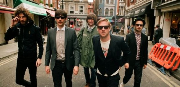
As music video very heavily features performance as a main component of it and as such, it's important to make sure these shots look good and are similar to already existing performances. We did research into how similar bands look when performing so that we can attempt to to imitate this look in our own video.
Lights: All the performances shown from above have some sort of lighting involved to improve the look of the concert. There is a lot of lighting behind the performers, creating a silhouette effect coming through them, this seems to be a common theme with all indie band performances. The setting is usually quite dark with spot lights used so you can see the artists. 

Stage: The stage is pretty much normal, there aren't any gimmicks or effects going on to add to the performance other than lighting. For this reason we should make the location of our performance quite simple, but pack the scene with musical equipment to make it look realistic. 

Stage Presence: There stage presence are quite powerful as they have to show the emotion of their song across to the audiences. There isn't much dancing going on, its mainly acting and being energetic on stage.

When we film our performance we should take into consideration all of the research we have collected on indie band performance as it can help us create a realistic performance which will ultimately improve our music video.

Wednesday, 25 November 2015

Website Design Draft

This is the current design of our bands website. It has the same purple color scheme that we have used while editing our photos and digipack to create a uniform look across our different areas. There will be working links to the store page where people will be able to buy our merchandise and we also intend to add a twitter feed banner down the side of all pages.
One thing we also wish to add to the top left of the page is a constant looping video of the waveform that goes over our logo that will play. There will also be a link to booking tickets for our tour which will also have a list of dates and locations for our tour.
We also intend to add links to an interview that we recorded of our band that will be under the video page that has a link at the top of the main page. The gallery shows photos from our various photoshoots that users of the page will be able to browse through.

Monday, 23 November 2015

Digipack Mountain

In the original draft of the digipack, we had a mountain but because we didn't take that picture ourselves, we were unable to use it in our final pack. To get around this. I used a Cintiq tablet and Photoshop to paint a mountain similar to the one in the original picture that we could use instead because it was an asset we made ourselves. I used a set of customized brushes to get the right textures for our it and used the colour dropper to get the colours from the original edited image so that i could make sure it would fit in with the rest of the digipack. Once I had drawn the mountain, I copy and pasted it, transformed the copy and flipped it horizontally before adding a guassian blur to it to give it the effect of being a reflection in the water.

Wave Form video test

This is a video test made to see how the logo could work with a moving waveform to possibly use in our video or on our website. It has the waveform part of our logo replicated several times over and has it move along horizontally like a normal waveform would on an audio track and then the text logo of our band fades in at the end.
The idea is to try and incorporate this into the beginning of our music video is possible and to put it in the corner of our website. This would work by having the waveform constantly moving in the corner over where the text would be to have a continuous animation rolling while the user of the page is on there.

Merchandise

For our website we needed to have items on a store page that fans of our band could go to and buy. We did research products that other bands like ours sell and found that for the most part, they sell a lot of t-shirts with things related to the band like the name or the logo. Because of this we have a bigger emphasis on clothing in our store, mainly t-shirts, hoodies and hats. We also have a design for a back pack as well as our album on the store too.

Logo redesign

After our halfway evaluation we came to the conclusion that our logo didn't suit our band as well as we had initially intended. To rectify this we went back to our research to look at other similar bands to come up with a new design that is more appropriate for our genre of band. We found that a lot of these bands don't have a symbol or something like that for their logo and rely more on bold text to get their image across.
Keeping inline with this, we took the font we chose earlier for our bands name and added a waveform pattern to the top of it. We did this because it goes with the text to stand out more and be a more recognizable brand, and by having the text and waveform the same single colour, we can change what colour it is depending on where the logo will appear. This single colour concept is something I found that lots of other logos do in and outside of music. Colour being the least important part of a wide variety of logos as long as it can be recognized by the people that see it.

Saturday, 21 November 2015

Filming Re-shoot Reflection

After putting together our first draft, we realised that most of the footage we had of our performance didn't come up looking as good as we'd hoped it would. Mainly, the shots were all too stationary and weren't lit as well as they should have been. The projector we had set up to project some of our flashback footage onto the backboard behind us also, hadn't shown up on the camera, making the entire narrative idea behind our video redundant.

All these problems made the first draft of our video a bit of a mess and so we had to scrap all of our performance shots and re-shoot them all. To make sure every problem we had in our previous shoot was fixed, we set up proper lighting, had more cameras, got more people to help out filming moving shots, used a different projector to the one we used last time and had someone working the light board at the back of the hall we were filming in to change the lighting during different parts of the song. 

After reviewing the footage from this, I can say that this second shoot was much more successful as the footage is much brighter, clearer and more varied. 

Website Second Draft


This is the newest draft of our website. It's now been completely overhauled from it's earlier state thanks to the feedback we received on the previous draft. We have altered the font for the band, changed the images that were shown in on the main page as well as added a twitter feed to the right of the screen. The band's new logo is now clearly on displayed clearly on the top of the page along side the links to the band's social media. We have also changed the side to be more colourful and visually engaging. as before people said they were confused about the genre of the band due to how dark the website was. The previous colour scheme also didn't match out digipack, changing it to be lighter and has helped create a more uniform identity for the band.

Monday, 16 November 2015

Photographic Techniques

This is a presentation talking a lot about framing and composition. There are a lot of techniques talked about here such as the rule of thirds, specific types angles and using depths of field to create different types of shots. In this presentation are also lots of examples that to making a magazine cover, something we will be doing to help promote our band.

Thursday, 12 November 2015

Digipack first Draft

This is the first draft of our digipack that we have put together. It uses a mix of photos that we took of us as the band and some more abstract imagery. We don't have too many photos of the band members as our research into other digipacks made by similar bands did not rely on an overuse of these types of shots. There is also a shot of a mountain that matches up with our band's name. 

Font Choice

This is the font we looked at when trying to come up with a brand image for our band. We found that lots of other bands similar to ours had their names in a bold or striking font that will be recognizable. We liked this font because, like the ones we saw other bands use, it is bold and the M's resemble mountains, which fits in with the summit part of our band's name.

Wednesday, 11 November 2015

Music Video trailer

This is the trailer for our music video that would be likely be shown on the front page of our website or posted on our band's twitter page. It plays through the chorus of the song and shows lots of brief clips from our video to tease what is in it to fans than follow our social media or check up on our website.

Halfway presentation

Powered by emaze

Storyboard for our music video


This is the storyboard that i made for our music video. It has sketches of just over 100 shots that we have planned out to make into our video. To plan this out we got together to go over what sort of shots we wanted and how we would have the performance area set up so that we knew what sort of shots and angles that we would be able to take. 
For our flashback shots, as we wouldn't know exactly how the area we were filming would be, we had to just come up with lots of shots that we thought would look good and then try our best to find places to get those shots when filming on location. This meant that our storyboard was never going to be completely accurate to the music video make but it is still something good to use as a reference while filming regardless.

Tuesday, 10 November 2015

Second Photo Shoot

When putting together our website and digipack we found that the original photos we had taken in our initial photo shoot weren't as fitting as we'd thought earlier and felt that it was necessary to go take more photos outside with the whole band as opposed to the green screen shots from our first shoot. This time around we took lots and lots of takes of each shot in slightly different poses and occasionally swapping positions in several to make sure we had enough photographs and enough to cherry pick the ones we felt were the best.
This time around we tried to go for looks that were more fitting of an indie band like ours. Before, in the green screen room, we each had our instruments in the shot but upon reflection decided that this was something that was necessary and cluttered up the shot too much and this time opted for a more natural look. Each of these shots were outdoors and are meant to show each member of the band in frame.

Imagine Dragons Steal 'O' Matic

This is the Steal 'O' matic I made from the Imagine Dragons Music video "Gold." They are a similar band to ours with and so we looked at their video to find examples of shots we would like to use in ours. This video is entirely performance based so the steal'o'matic contains a short variety of shot types and camera movements that are used when filming a performance. This is significant for us because our video will have lots of performance shots in it and so we can take some of the shots from this and attempt to replicate them to make our video better and more interesting to watch. We can also look at how long or short some of the shots are to make a note of for when it comes to editing our video. The pace of a music video is important so having a good example to use for reference is very useful to us.

Sunday, 1 November 2015

Album Cover

As part of our digipack, we had to create a front cover for our band. This section of the digipack, I had the most input in as it required a lot of photo manipulation in photoshop and in our group I am the most experienced with this software. To create this, I had to extend the height of the wall from the original photograph. In the original, the wall was cut off by windows that, if were in the final edit would have got in the way with the band logo and the name of the album. I remove the windows I used the clone stamp tool to sample areas of the wall that were complete and replaced the windows with the wall texture that had been sampled lower down in the image. I also added a RBG colour filter over the image to alter the amounts of red, green and blue in the image. I lowered the amount of green over all as our band's image relies mostly on purples and reds.

To create the spray paint effect on the logo and album name behind use. I wrote the words in a text layer, white for the logo and black for the name and put them behind us. To make the 'Amplify' appear as if it was behind the band members, I cut us out using the pen tool to mark us out, duplicating is and pasting a version of us over the top of the amplify layer. I then rasterized the text layers to image layers and turned them the layer style to multiply. This makes them clear and increases the brightness of them. I then  duplicated the layers to exaggerate this effect and added a guassian blur to them to make it look like it had been air brushed. I then merged the layers back together and with an erase tool with a 15% opacity, erased bits of the words to make it appear faded and seem like it had been spray painted onto the wall some time ago.


Wednesday, 21 October 2015

Group Timetable

This is a timetable of our group, when we have media lessons and when we all have frees so we know when each of us can work together on group work and when we will need to spend time working on the project individually.

Tuesday, 20 October 2015

Theatre Sketch

This is a sketch Marcus did of a theatre, laying out how we envision the performance section of our music video looking. it shows where each member of the band would be, the projection shooting through the band to the screen behind the performers as well as how the band will be raised up over the crowd.

Breakdown of annotated Lyrics & Timeline


Lip Sync practice of our Song

This is a video of Marcus and I practicing lip syncing to the song we chose to make our video for. We filmed it in the green screen room and I edited the two cuts together after synchronizing them with the song.

Sunday, 18 October 2015

Twitter and Facebook

We created both a Facebook and a Twitter page for our band so that we could both promote our band through social media and gain traction that way, but also to interact with followers or fans of the band through this medium as this is something lots of band do, especially smaller ones. We have so far only posted a little on these as we have just set them up 

Friday, 16 October 2015

Media Talk Presentation

These are the tips we were given during a media talk that should help us in planning and constructing our music video.

Tuesday, 13 October 2015

Southend Shooting Schedule

This is the list of all the shots we want to film on our shooting trip to Southend. We have all of the shots planned out as well as where about we need to be to get them.

Saturday, 10 October 2015

Similar Videos that Inspire ours


I like the  performance of this video. As it nothing but performance, it used everything it can to keep it looking consistently visually interesting to the audience. There is a lot of shot variety including lost of interesting and unusual camera moments throughout this video. The lighting too has a big impact on this video. The lighting acts almost light thought beats, changing in time with the cutting of the video to match the changing pace of the song as it transitions from a verse to a chorus. 


This video uses a practical effect by using a video projector to play old footage from a a flashback through the performer. As a group we like this concept and it it something we have tried to incorporate into the planning of  our video and will hopefully be part of our final video once we have put it together.

Jake Wynne and Filming Robbie Williams Video


Friday, 9 October 2015

Similar Band's Costumes

When we perform our music video we need to make sure we look like an indie band or the video would look very unprofessional as it would seem as if 3 students are performing rather than 3 band members. For this reason we did some research into what indie bands generally wear, here are some key features:
- Smart shoes or plain trainers
- Jacket or blazer, often leather involved and often black
- Jeans almost always black, sometimes denim
- T shirt or buttoned shirt, often white or black
- Sometimes wear sunglasses

Here are some examples of indie band clothing below:

Thursday, 8 October 2015

1st Band Photoshoot

After looking at photos of similar bands to us, we took these photos to try and get similar results to the other bands. They were taken in the green room so that later on they might be doctored in photoshop to appear more like the photos that one would expect to see from a band like ours.

Performance Shooting Schedule


Wednesday, 7 October 2015

Letter to the artist

We had to put together an email to send to the band who wrote and performed our song to ask for permission to make a music video with their song.

Chosen Song Lyrics

It starts in the theatre, a night of encounters
If I hadn't been there, if not for a cigarette

And you could see it change
Look past the blinding light, look past the blinding light
Just keep talking now
Tell me your favourite things, tell me your favourite things

Difference in opinion was never an issue
Collect all your questions 'cause this time we've all night

And you could see it change
Look past the blinding light, look past the blinding light
Oh, just keep taking now
Tell me your favourite things, tell me your favourite things

And you could see it change
Look past the blinding light, look past the blinding light
Just keep taking now
Tell me your favourite things, tell me your favourite things

Media Talk Presentation

This is a presentation from Pete Fraser, who works in media and this makes up tips that will help us be successful in our coursework this year in putting together our music video.

Tuesday, 6 October 2015

Locations

from the initial ideas for our music video, we have come up with a list of places that we think we should be able to go to to film the scenes and shots we've come up with. These places are for the most part, far removed from each other so filming our video across all of these places will be challenging.

This is South End on Sea. This is a town nearby that has a beach on the seafront. In our planning so far we have come up with ideas for a flash back type sequence that would be made better if we could get shots for even a few seconds at the beach.
<

Song lyrics for our chosen song

The lyrics to "Cigarettes in the Theatre"

It starts in the theatre, a night of encounters
If I hadn't been there, if not for a cigarette

And you could see it change
Look past the blinding light, look past the blinding light
Just keep talking now
Tell me your favourite things, tell me your favourite things

Difference in opinion was never an issue
Collect all your questions 'cause this time we've all night

And you could see it change
Look past the blinding light, look past the blinding light
Oh, just keep taking now
Tell me your favourite things, tell me your favourite things

And you could see it change
Look past the blinding light, look past the blinding light
Just keep taking now
Tell me your favourite things, tell me your favourite things

Logo Colour Scheme

After settling on the look of our logo, our next step was to experiment with colour schemes to see what we liked. To do this Marcus made a digital version of our logo on Paint and then changed the combination of the colours on the logo to experiment and display what color combinations looked the best and suited our band.

Band Logo Ideas

The name we came up with for our band is loud summit. We spent a day or two going through dozens and dozens of names and in the end we felt as if that name suited us and the song we chose to make our video for. To go with the theme of summit, we wanted our logo to resemble a mountain in some way and these are out initial designs for our logo.